
Our Clients
Expert Responsive Web, Design & Development
What We Do
We specialize in responsive web design and development, ensuring that your website delivers a seamless, engaging, and high-performance experience across all devices. Our team leverages the latest HTML5, CSS3, JavaScript, and front-end frameworks to craft fluid, mobile-friendly, and scalable digital solutions tailored to your business needs.
We focus on intuitive user interfaces, fast-loading pages, and adaptive layouts that enhance user engagement and boost SEO rankings. By implementing flexible grids, media queries, and optimized graphics, we ensure that your website looks stunning and performs flawlessly on desktops, tablets, and smartphones.
Whether you need a brand-new responsive website or want to revamp your existing platform, our expert developers are ready to bring your vision to life. With a mobile-first approach and future-proof design strategies, we help businesses stay ahead in the competitive digital landscape. Partner with us and experience the difference of a truly responsive web solution!
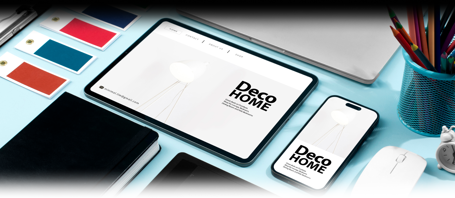
Responsive Web Design Solutions
Future-Ready Design
Projects
Portfolio
Year
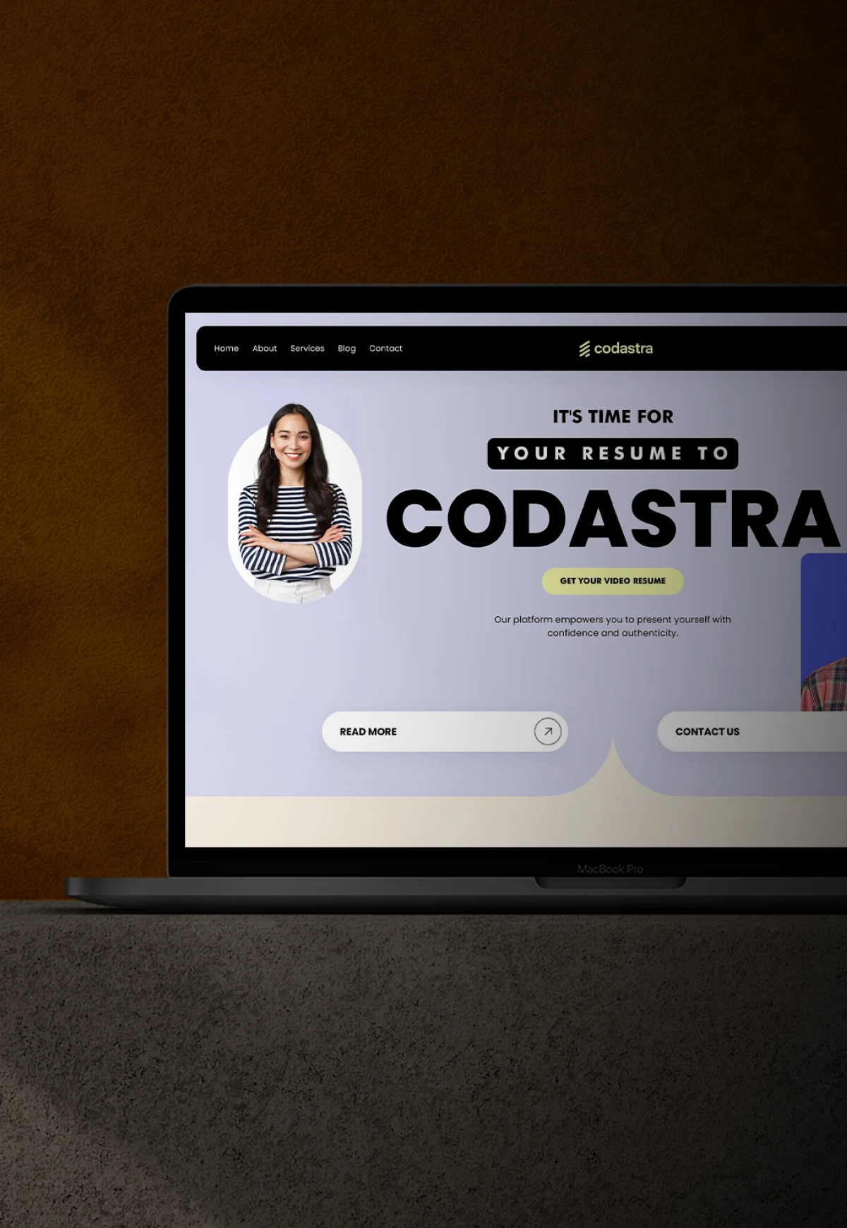
2025
Role
Website Brands
Description
Condastra is a modern digital solution designed to simplify complex processes and create meaningful online experiences.
All Projects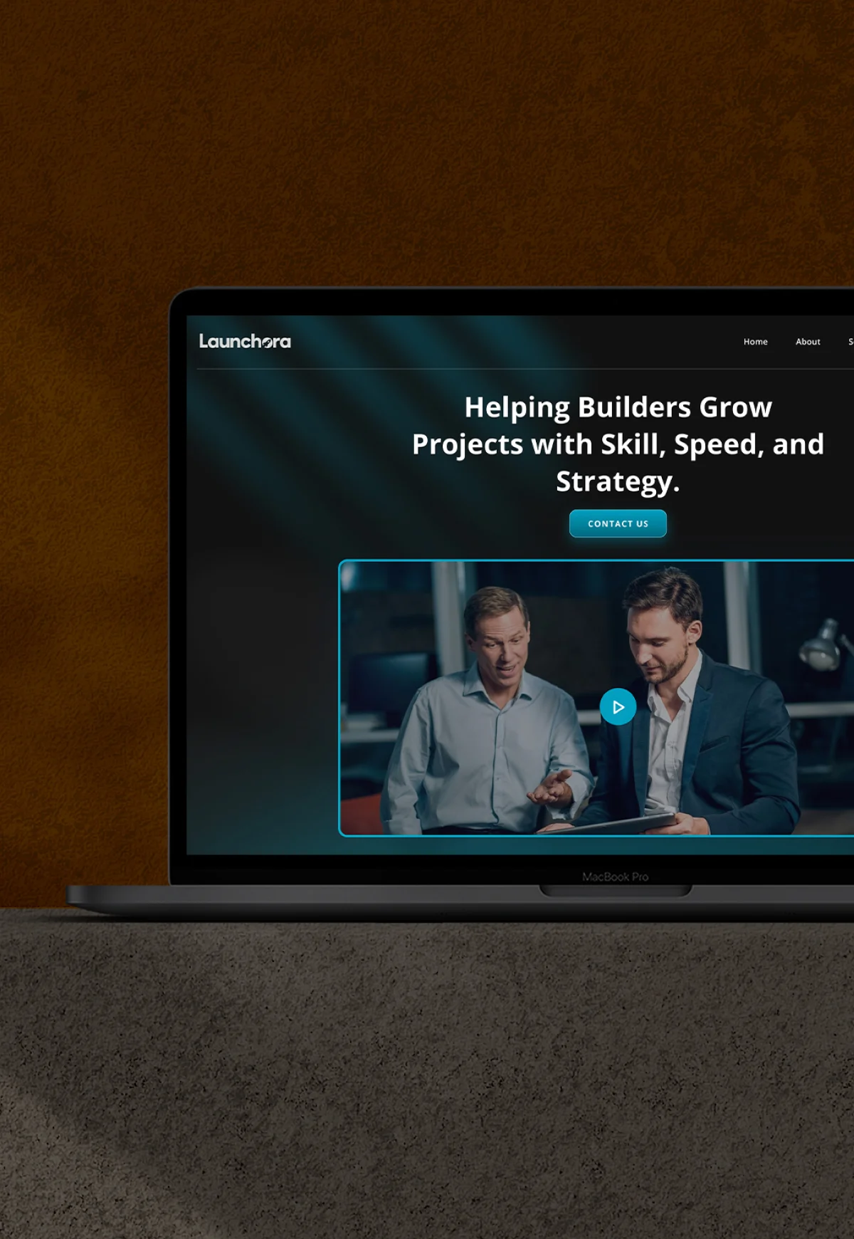
Year
2019
Role
Website Brands
Description
Launchora is a storytelling-driven platform designed to turn ideas into impactful experiences.
All Projects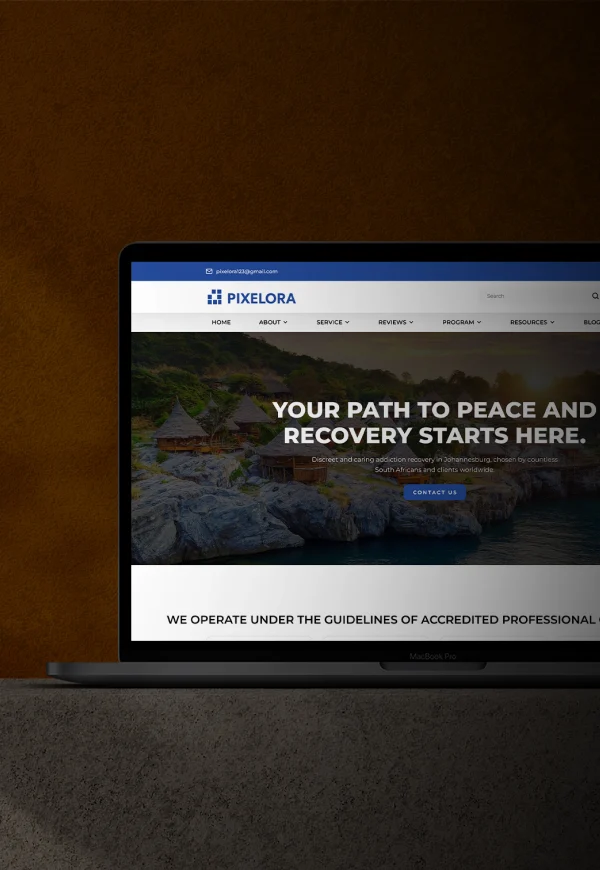
Year
2020
Role
Website Brands
Description
Pixelora is a creative-first digital brand built to inspire, engage, and convert through visually stunning design and seamless functionality.
All Projects
Launchora
Pixelora
Technology Stack for Scalable Responsive Design Solutions
Platform
-
 WordPress
-
 Shopify
-
 Webflow
-
 Magento
Back-End Development
-
 Node.js
-
") Laravel (PHP)
Laravel (PHP)
-
 Django
App Design
-
 Adobe XD
-
 Figma
Figma
-
 InVision

Hire Responsive Design Development Experts
Responsive Specialists
A seamless, user-friendly, and fully responsive website is key to engaging modern audiences. Our skilled developers specialize in crafting adaptive, fast-loading, and visually compelling designs that work flawlessly on desktops, tablets, and smartphones. By leveraging the latest front-end technologies, we ensure your site is optimized for performance, accessibility, and SEO. Stay ahead in the digital space with a future-ready, mobile-first web solution built to captivate and convert.
Connect With Our TeamYour Trusted Partner for Responsive Web Solutions
Why We Stand Out
Expert Team
Our skilled developers and designers bring years of experience in crafting responsive, high-performance, and visually stunning websites that engage users.
Innovative Solutions
We leverage the latest technologies and frameworks to build future-proof, scalable, and adaptive web solutions tailored to your business needs.
Client-Centric Approach
Your vision is our priority! We create customized, user-friendly designs that enhance engagement and drive growth for your brand.
Quality Assurance
Every project undergoes rigorous testing, optimization, and performance checks to ensure a seamless and error-free user experience.
Timely Delivery
We value your time and ensure efficient project execution, delivering high-quality websites within agreed deadlines without compromising on quality.
Continuous Support
Our dedicated support team provides ongoing maintenance, updates, and technical assistance to keep your website running smoothly at all times.

Business Verticals We Cater To
Industries We Support


Streamlined Responsive Design Development Process
Our Proven Process
Step 1
Discovery & Planning
We analyze your business needs, target audience, and goals to craft a strategic roadmap for a seamless, responsive design.
Step 2
Wireframing & Prototyping
Creating structured layouts and interactive prototypes to visualize the user journey and ensure an intuitive experience.
Step 3
UI/UX Design
Designing visually stunning, user-friendly interfaces that adapt seamlessly across all devices and screen sizes.
Step 4
Front-End Development
Implementing clean, optimized code using HTML, CSS, and JavaScript to build a fast and responsive website.
Step 5
Testing & Optimization
Conducting rigorous cross-device and cross-browser testing to ensure flawless performance, speed, and accessibility.
Step 6
Launch & Maintenance
Deploying the website with ongoing support, updates, and improvements for long-term scalability and success.
Quick Help
Frequently Asked Questions (FAQs)
What is Responsive Design, and why is it important?
Responsive design ensures a website adapts seamlessly to different screen sizes and devices, providing an optimal user experience. It enhances usability, improves SEO rankings, and increases engagement.
How does Responsive Design impact SEO?
Google prioritizes mobile-friendly websites, so a responsive design improves search rankings, reduces bounce rates, and enhances user experience, leading to better organic traffic.
Which technologies are used for Responsive Design Development?
Key technologies include HTML5, CSS3, JavaScript, Bootstrap, Tailwind CSS, and frameworks like React.js and Vue.js, ensuring fluid and adaptable layouts.
Will my existing website be converted into a responsive design?
Yes, we can revamp your existing website with responsive design techniques to make it fully adaptable across all devices while maintaining your brand identity.
How long does it take to develop a responsive website?
The timeline depends on project complexity, but a standard responsive website typically takes 4 to 8 weeks, including design, development, and testing.
Does Responsive Design work on all browsers?
Yes! A well-developed responsive website ensures cross-browser compatibility, working flawlessly on Chrome, Firefox, Safari, Edge, and more.
Is a responsive website different from a mobile app?
Yes, a responsive website adjusts to different screens via a web browser, while a mobile app is a standalone software designed specifically for iOS or Android devices.
Can a responsive website improve conversion rates?
Absolutely! A responsive design enhances usability, speeds up loading time, and provides a seamless experience, leading to higher conversions and customer retention.
What industries benefit most from Responsive Design?
All industries can benefit, especially eCommerce, healthcare, finance, education, travel, and media, where user experience is crucial for engagement and sales.
How do you ensure a website is fully responsive?
We use fluid grids, flexible images, media queries, rigorous device testing, and performance optimizations to guarantee a pixel-perfect, responsive experience.
Blog
Recent Blogs


Reviews
Appreciation From Clients
"Incredible Collaboration!"
"Our journey with Cypherox Technologies was exceptional. Their dedication to understanding our needs and translating them into a stunning app was commendable. Kudos to the team for their professionalism and top-notch delivery!"

"Exceeded Expectations!"
"Cypherox not only met our expectations but surpassed them. Their attention to detail and commitment to quality shone through in every phase of app development. Thanks for bringing our vision to life!"

"A True Partner!"
"Working with Cypherox Technologies was like having a supportive partner throughout the entire process. Their proactive communication and unwavering support made the app development journey smooth and enjoyable. Highly recommended!"

"Outstanding Results!"
"Choosing Cypherox was the best decision we made for our app development. Their expertise and dedication led to outstanding results. We're thrilled with the final product!"