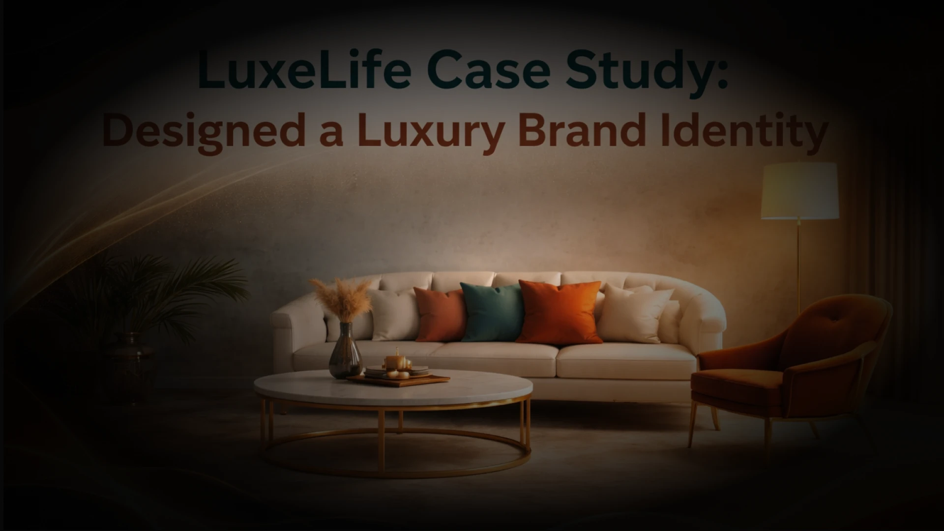
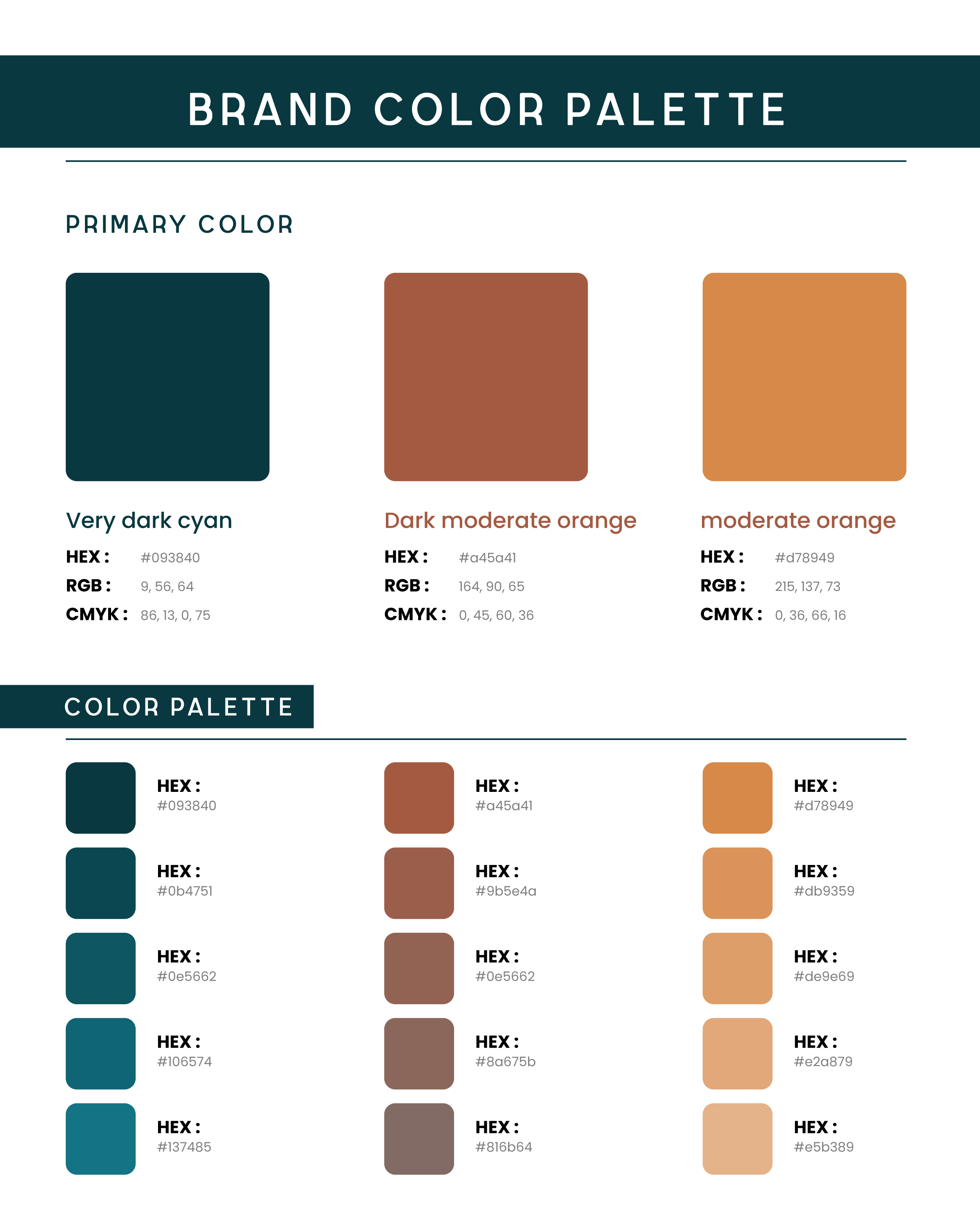
LuxeLife Brand Identity Case Study
Year

2025

Role

UI/UX Development and Branding

LuxeLife Case Study: Designed a Luxury Brand Identity

Industry: Luxury Home Staging & Interior Design

Services: SEO · Google Business Profile Optimization · Technical SEO · Content Strategy

Project Overview

LuxeLife is a premium furniture and lifestyle brand positioned at the intersection of timeless elegance and contemporary living. The brief was to craft a complete brand identity from logo and color system to usage guidelines that could confidently represent the brand across both digital and print touchpoints.

The core objective was to establish a visual identity that communicates luxury without feeling cold, and warmth without compromising on sophistication.

The Problem

Luxury furniture is a saturated market. Brands either lean too far into minimalism, becoming forgettable, or overdesign to the point of losing credibility. LuxeLife needed an identity that:

  • Felt premium and aspirational to a discerning audience

  • Remained versatile across digital platforms, print collateral, packaging, and signage

  • Communicated both the warmth of a home and the craftsmanship of luxury

  • Worked across light and dark backgrounds without losing visual integrity

  • Stood out from competitors while remaining timeless, not trendy

Research & Discovery Phase

Competitive Analysis

Before opening Figma, an extensive competitive audit was conducted across 20+ luxury furniture and lifestyle brands globally. Key observations:

  • Most luxury brands over-rely on black, white, and gold, a predictable and saturating combination

  • Very few competitors use warm teal as a primary brand color, a significant white space opportunity

  • Script logotypes are common in this space, but rarely paired with strong geometric secondary marks

  • Brands with dual-concept logo systems (icon + wordmark variants) consistently perform better across multi-channel applications

Moodboard & Reference Curation

Reference gathering was conducted across Behance, Muzli, Dribbble, Pinterest, and Are.na to build a curated moodboard. The focus areas were:

  • Art Deco and mid-century modern interior photography

  • High-end serif and script typeface pairings

  • Warm earth tone and deep jewel tone brand systems

  • Premium packaging and stationery mockups from the hospitality and furniture sectors

The reference image used throughout the project, a styled vignette featuring a pink velvet sofa, marble coffee table, and gold accents against a sage green wall, served as the visual north star for the entire color and mood direction.

Client Brief & Stakeholder Alignment

A structured discovery questionnaire was shared via Notion to capture brand personality keywords, target audience profiles, competitor references (liked and disliked), and platform priorities. This document was maintained as a live brief throughout the project, keeping all feedback and revisions tracked in a single source of truth.

Design Process

Working in Figma

The entire project was executed in Figma, leveraging its most current capabilities:

  • Figma Variables: Used to define and manage the brand color tokens (primary, secondary, tint scales) as reusable design tokens that map directly to future UI or web development handoffs

  • Component-based logo system: Each logo variant was built as a Figma component with properties for color scheme (dark background / light background/color), allowing rapid switching during presentations

  • Auto Layout: Used in all brand presentation frames for clean, responsive spacing and scalable layouts

  • Figma Prototyping: An interactive brand presentation prototype was built so the client could navigate through all deliverables at their own pace, rather than a static PDF

  • Dev Mode: All final assets were handed off via Figma Dev Mode, with color tokens, typography specs, and export-ready SVGs accessible to developers directly from the file

Logo Design

Two distinct logo concepts were developed and presented, each targeting a different positioning angle while sharing the same brand color system.

Concept 1: Script Elegance

A flowing script logotype built around a handcrafted cursive treatment of "LuxeLife," paired with a refined chaise lounge icon nestled within the letterforms. A thin underline with a subtle warm tone provides grounding and structure beneath the flowing script.

This concept communicates heritage, craftsmanship, and the personal warmth of a curated home. It performs best on editorial content, lifestyle photography overlays, premium packaging, and social media branded content.

luxelife-brand-identity-logo-design-01

Concept 2: Structured Luxury

A clean, spaced uppercase wordmark "LUXELIFE" paired with a framed icon mark combining a floor lamp and a lounge chair within a precise square border. The geometric restraint of the icon contrasts intentionally with the organic forms of the furniture it depicts.This concept communicates confidence, modernity, and editorial authority. It performs best in digital UI, signage, product labeling, and contexts where a more architectural brand presence is required.

Both concepts were presented in all four brand color combinations: deep teal, dark orange, warm amber, and white, demonstrating full versatility before client selection.

luxelife-brand-identity-logo-design-02

Brand Color Palette

The color system was built with deliberate psychological and aesthetic intent, moving away from the predictable luxury default of black and gold.

Primary Colors

Very Dark Cyan:

The dominant brand color. A deep, almost forest-like teal that communicates depth, trust, and quiet sophistication. It anchors the identity and performs as the primary background in dark-mode applications.

Dark Moderate Orange:

A warm, terracotta-leaning tone that introduces human warmth and grounded elegance. Used as an accent and secondary brand color, it references natural materials, aged leather, rich wood, and fired clay, all central to luxury furniture as a category.

Moderate Orange:

A brighter, more energetic amber that functions as the brand's highlight color. It draws attention without screaming, adding life and warmth to compositions that might otherwise feel heavy.

Color Scale System

Beyond the three primary brand colors, a full 5-step tint scale was developed for each hue, providing a complete and flexible design system for UI components, backgrounds, hover states, and data visualization should the brand expand into digital product design.

Color Psychology Rationale

The combination of deep teal and warm earth tones is uncommon in this market segment, which is precisely what makes it ownable. Teal signals exclusivity and calm; the warm oranges signal livability and comfort. Together, they say: this is a luxurious space you can actually live in, which is the exact emotional position LuxeLife occupies.

luxelife-brand-identity-color-palette

Typography Direction

While full typeface licensing was scoped separately, the following typographic pairing was recommended and used throughout brand presentations:

  • Display / Logo: Custom script treatment with characteristics drawn from calligraphic serif traditions, fluid, intentional, warm

  • Headline: High-contrast editorial serif conveying authority and timelessness

  • Body / UI: Geometric sans-serif with wide tracking, clean, modern, legible at all sizes

Deliverables

  • 2 full logo concepts × 4 color variants each

  • Primary, secondary, and monochrome logo files (SVG, PNG, PDF)

  • Brand color palette with full HEX, RGB, and CMYK values

  • 5-step tint scale for each primary color

  • Typography pairing recommendation with usage guidelines

  • Logo usage guidelines (minimum sizes, clear space, incorrect usage examples)

  • Figma source file with all components and design tokens

  • Mockup presentations across business card, packaging, signage, and digital UI contexts

Tools & Technology Stack

Tool Purpose
Figma Primary design, prototyping, component system, Dev Mode handoff
Figma Variables Design token management for colors and typography
Adobe Illustrator Final vector refinement and print-ready export
Notion Client brief, feedback tracker, project documentation
Coolors Color palette exploration and accessibility contrast checking
Muzli / Behance / Dribbble Trend research and visual reference curation
Pinterest & Are.na Moodboard building and aesthetic direction
Stark (Figma Plugin) WCAG color contrast accessibility validation
Unsplash / Pexels Lifestyle photography for mockup presentations
Typescale.com Typography scale ratio planning
Mobbin UI pattern reference for any digital brand touchpoints

Outcome

The brand identity system delivered a cohesive, versatile, and strategically grounded visual language for LuxeLife. The dual-concept approach provided the client with meaningful creative choice, and the final system was structured to scale from a single logo to a full design system without requiring foundational rework.

The color palette in particular emerged as the most distinctive asset of the identity: uncommon enough in the luxury furniture space to be ownable, yet grounded enough in warmth and natural tone to feel immediately right for the category

Want a brand identity system built with this level of strategic depth?

Let's build it together.

Customer support representative of Cypherox

Contact

Talk to Us