Key Sections & UX Decisions
1. Hero Section: "Start Your Next Adventure"
A full-width cinematic hero with a family silhouette walking through a glowing forest tunnel. Two
clear CTAs, Become a Foster Parent and Partner With Us, are immediately visible, reducing friction for
both primary audiences.
2. Foster Care Adventure Today
Three feature cards frame the foster care process as an adventure roadmap:
-
Meet Your Guides: Introducing the support team
-
Hero Training Camp: Presenting training as empowerment
-
The Adventurer's Toolkit: Positioning resources as tools for success
This reframing reduces anxiety and increases engagement from first-time visitors.
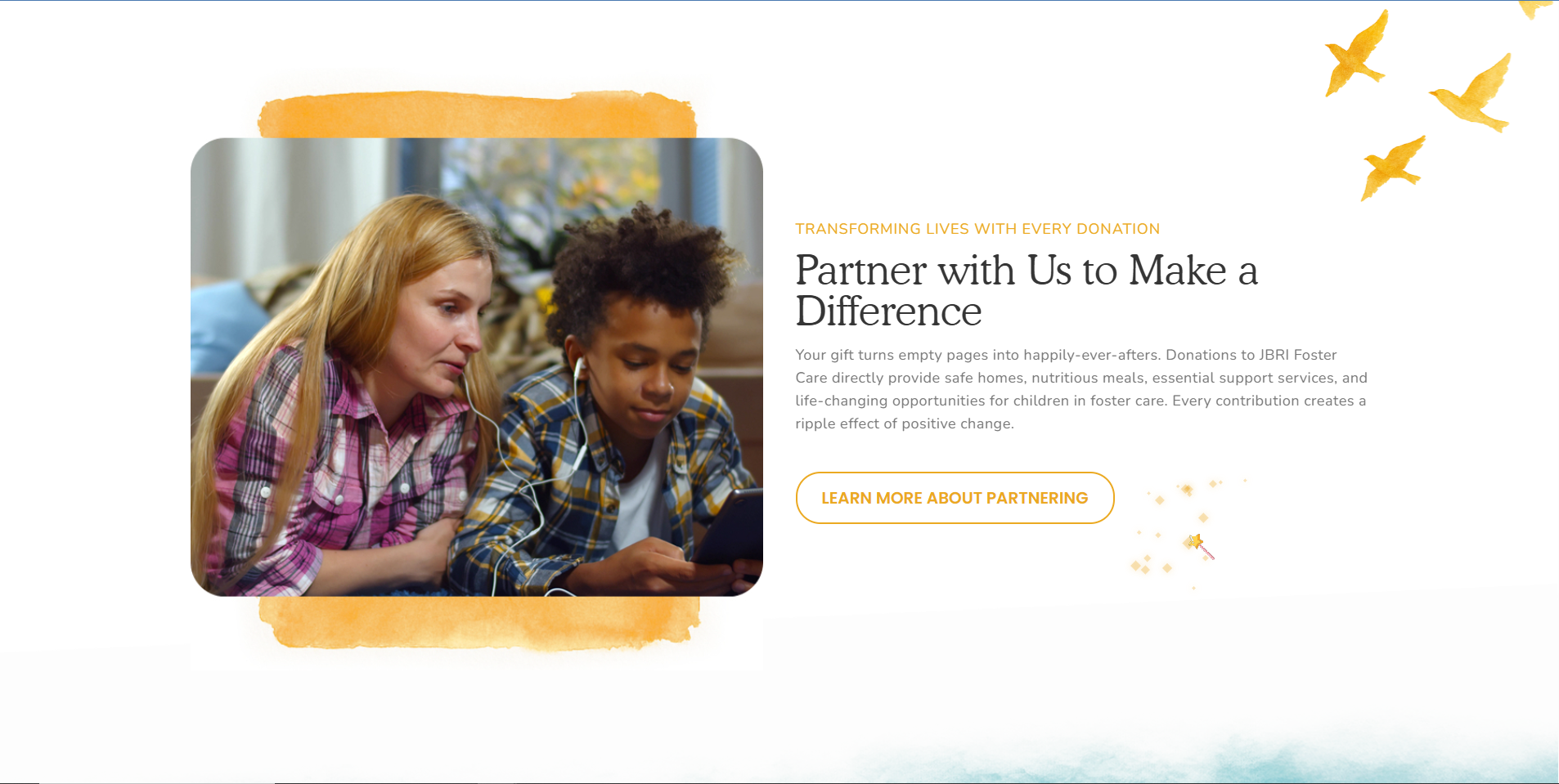
3. Partner With Us to Make a Difference
A split-layout section with a real photo of a foster family alongside partnership messaging. The use
of authentic photography here grounds the fantasy aesthetic in real human connection.
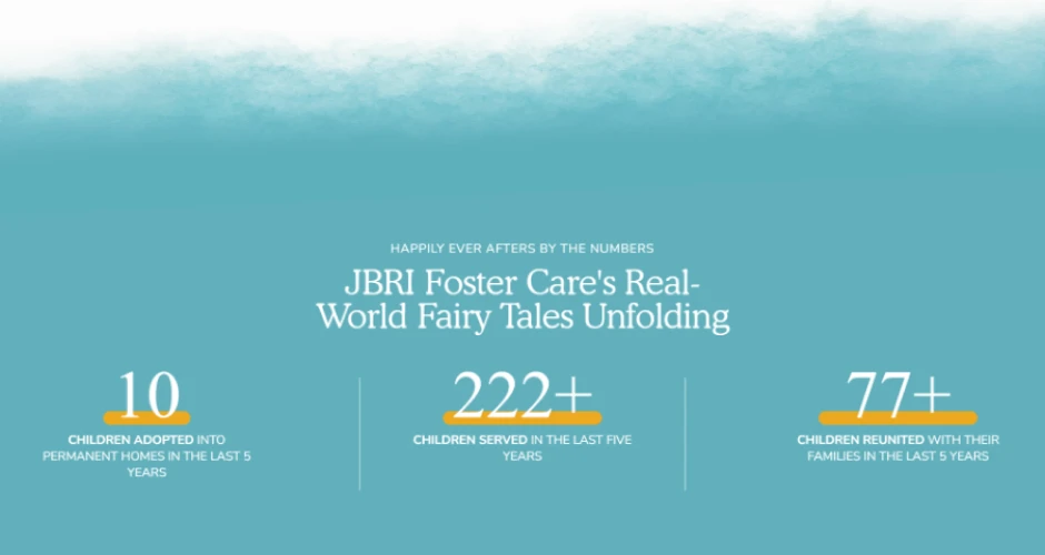
4. Impact Statistics
Bold numerical stats (10, 222+, 77+) displayed over a dreamy teal cloudscape background. These
numbers communicate credibility and scale without feeling boastful; the fairy tale framing
contextualizes them as lives changed, not just metrics.
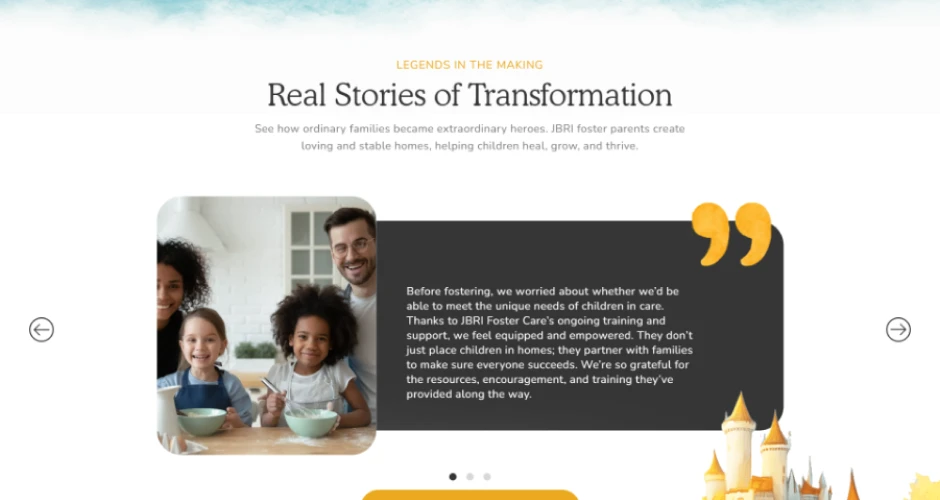
5. Real Stories of Transformation
A testimonial carousel using a dark card with a large quotation mark, warm, readable, and emotionally
resonant. Paired with a fantasy castle illustration to reinforce the "real-world fairy tale"
narrative.
6. Footer
Clean and functional with clear navigation, contact information, and a soft echo of the brand
illustration style, ensuring the design feels complete rather than cut off.